Cursor: A Beginner's Workshop on Data Science Using AI
Explore NYC subway demographics using AI-assisted coding in Cursor IDE. Starting from 3 public datasets (MTA ridership, Census income, liquor licenses), you'll explore & summarize patterns, create visualizations, build an interactive dashboard, and experiment with sonification or 3D visualizations. No prior Cursor experience needed.
By Isaac Steinberg · January 30, 2026
Tools Used
Content Available
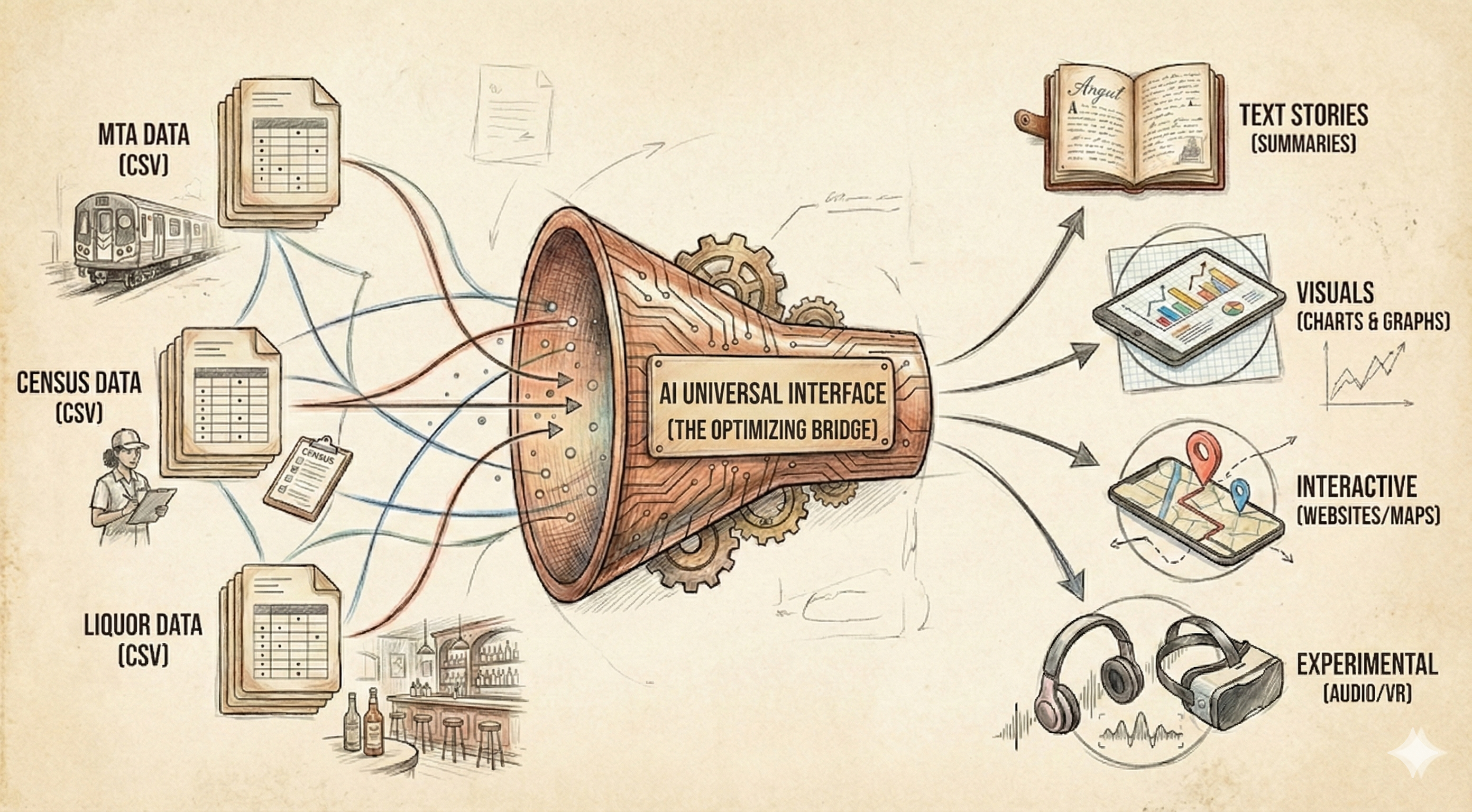
Welcome to this hands-on workshop where you'll explore NYC subway demographics using Cursor IDE and AI assistance. You'll take raw data from three public sources, analyze patterns, create visualizations, build an interactive website, and experiment with creative data representations—all without writing code from scratch.
This workshop demonstrates the power of AI-assisted data science: you provide the prompts and guidance, and Cursor helps you build the analysis pipeline.
Datasets Overview
You'll work with three NYC-focused datasets that together reveal the "personality" of each subway line.
| Dataset | Source | Rows | Size | Description |
|---|---|---|---|---|
| MTA Subway Ridership | data.ny.gov | ~2M | ~1-2GB | Hourly ridership data by station, including timestamps, payment methods, and geographic coordinates |
| Census Income | data.census.gov | ~2,300 | ~200MB | Median household income by census tract for NYC's five boroughs |
| Liquor Licenses | data.ny.gov | ~14,600 | ~50MB | Active liquor licenses (bars, restaurants) with addresses and geographic data |
Data Structure
MTA Ridership Columns
| Column | Example |
|---|---|
transit_timestamp | 06/18/2023 10:00:00 AM |
station_complex | 81 St-Museum of Natural History (C,B) |
borough | Manhattan |
payment_method | omny, metrocard |
ridership | 2, 12, 156 |
latitude, longitude | 40.781433, -73.972145 |
Census Income Columns
| Column | Example |
|---|---|
name | Census Tract 3; Richmond County; New York |
median_income | 74258.0 |
county_name | Richmond (Staten Island) |
tract | 000300 |
Liquor Licenses Columns
| Column | Example |
|---|---|
premisescounty | New York, Kings, Bronx |
description | Restaurant, Additional bar |
actualaddressofpremises | 4 PENNSYLVANIA PLAZA |
city | NEW YORK, BROOKLYN |
georeference | {'type': 'Point', 'coordinates': [-73.99224, 40.75058]} |
Workshop Phases
The workshop is divided into five phases, each building on the previous. For each phase, you'll paste the associated prompt into Cursor's chat, and the AI will help you build the required scripts and outputs.
Phase 0: Download Data
Goal: Download all three datasets and save them locally.
You'll create a Python script that fetches data from public APIs and saves CSV files to the data/ folder.
Output: data/mta_ridership.csv, data/census_income.csv, data/liquor_licenses.csv
📄 View Full Prompt (00_download.md)
# Phase 0: Download Datasets

## Goal
Download three datasets for NYC subway demographics analysis.

## Datasets

### 1. MTA Subway Hourly Ridership
- **URL**: https://data.ny.gov/Transportation/MTA-Subway-Hourly-Ridership-2020-2024/wujg-7c2s
- **Size**: ~1-2GB
- **Download method**: Use Socrata API or direct CSV export
- **Save as**: `data/mta_ridership.csv`

### 2. Census ACS 5-Year (Income + Occupation)
- **URL**: https://data.census.gov
- **Tables**: B19013 (Median Income), C24010 (Occupation)
- **Filter**: NYC counties only (New York, Kings, Queens, Bronx, Richmond)
- **Size**: ~200MB
- **Save as**: `data/census_income.csv`

### 3. NYS Liquor Authority Active Licenses
- **URL**: https://data.ny.gov/Economic-Development/Current-Liquor-Authority-Active-Licenses/9s3h-dpkz
- **Size**: ~50MB
- **Filter after download**: NYC counties, License Type = "OP" (on-premise bars/restaurants)
- **Save as**: `data/liquor_licenses.csv`

## Task
Create `scripts/00_download.py` that:
1. Creates `/data` folder if it doesn't exist
2. Downloads each dataset (use requests or sodapy for Socrata API)
3. Saves to CSV
4. Prints file sizes and row counts when complete

## Expected Output
```
data/
├── mta_ridership.csv      (~1-2GB, millions of rows)
├── census_income.csv      (~200MB, ~2000 tracts)
└── liquor_licenses.csv    (~50MB, ~30k NYC records)
```

## Notes
- MTA file is large — consider streaming download or chunked processing
- Census API may require filtering by state/county FIPS codes (36061, 36047, 36081, 36005, 36085)
- For liquor licenses, download full file then filter to NYC in Python
Phase 1: Text Overview
Goal: Explore and summarize the data through statistics and initial observations.
You'll analyze each dataset's shape, distributions, and interesting patterns, then combine them for a preview of cross-dataset insights.
Output: outputs/summary.md
📄 View Full Prompt (01_explore.md)
# Phase 1: Text Overview (Explore & Summarize)

## Goal
Understand the three datasets through summary statistics and initial observations.

## Prerequisites
- `data/mta_ridership.csv`
- `data/census_income.csv`
- `data/liquor_licenses.csv`

## Task
Create `scripts/01_explore.py` that generates a markdown summary.

## Analysis to Perform

### MTA Ridership
- Total rows
- Date range (min/max dates)
- Count of unique stations
- Count of unique subway lines
- Top 10 busiest stations (by total ridership)
- Top 10 busiest lines (by total ridership)
- Sample of columns and data types

### Census Income
- Number of census tracts
- Income range (min, max, median)
- Top 5 highest income tracts (neighborhood names if available)
- Bottom 5 lowest income tracts
- Average income by borough/county

### Liquor Licenses
- Total active licenses in NYC
- Breakdown by license type
- Count by borough
- Top 10 neighborhoods by bar density

### Cross-Dataset Preview
Pick any subway line as example (e.g., L, 7, A, G):
- List all stations on that line
- For each station, note the census tract it's in
- Show median income of those tracts
- Count bars within nearby area (same zip or rough proximity)

Repeat for 2-3 lines of interest to compare.

## Expected Output
Save to `outputs/summary.md`:
```markdown
# NYC Subway Demographics: Data Overview

## MTA Ridership
- **Rows**: X million
- **Date range**: YYYY-MM-DD to YYYY-MM-DD
- **Stations**: X unique
- **Lines**: X unique

### Busiest Stations
1. Station A - X riders
2. Station B - X riders
...

## Census Income
...

## Liquor Licenses
...

## L Train Preview
...
```

## Notes
- Use pandas for data loading
- For large MTA file, consider chunked reading or sampling
- Print progress as you go
Phase 2: Charts
Goal: Create visualizations that reveal patterns and test hypotheses about subway line personalities.
You'll build five charts showing ridership patterns, income distributions, bar density, and multi-dimensional personality profiles.
Output: outputs/charts/hourly_ridership.png, income_by_line.png, bar_density.png, weekend_ratio.png, personality_radar.png
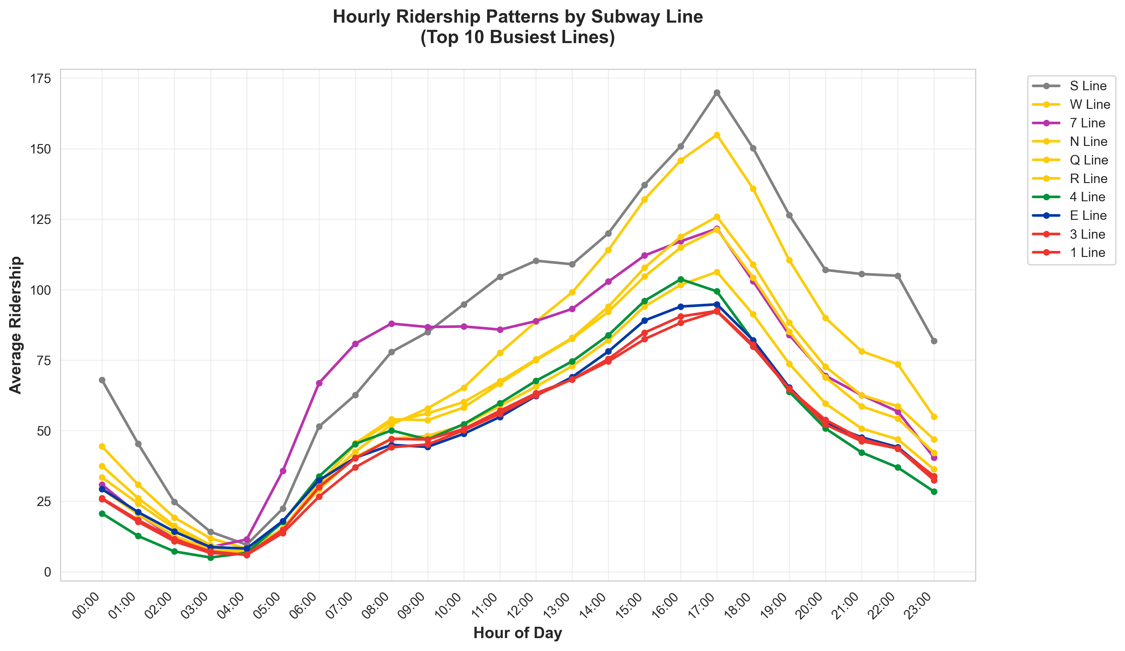
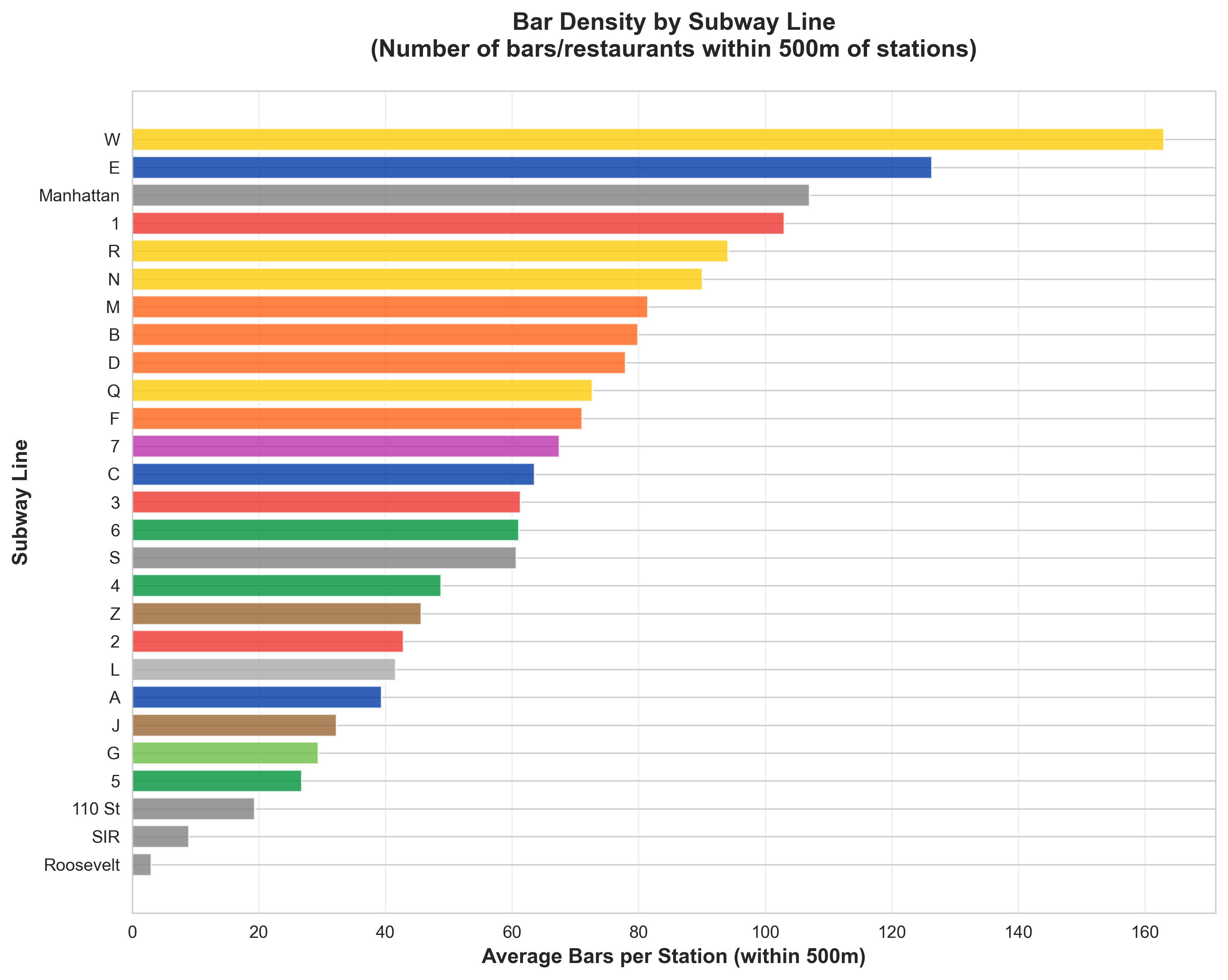
Hourly ridership patterns (left) and bar density by subway line (right) — sample Phase 2 chart outputs.
📄 View Full Prompt (02_charts.md)
# Phase 2: Charts (Visual Analysis)

## Goal
Create visualizations that reveal patterns and test our hypothesis about subway line personalities.

## Prerequisites
- `data/mta_ridership.csv`
- `data/census_income.csv`
- `data/liquor_licenses.csv`
- Spatial join data (stations → tracts → licenses)

## Task
Create `scripts/02_charts.py` that generates PNG charts.

## Charts to Create

### Chart 1: Ridership by Hour (Line Comparison)
- **File**: `outputs/charts/hourly_ridership.png`
- **Type**: Line chart
- **X-axis**: Hour of day (0-23)
- **Y-axis**: Average ridership
- **Series**: All major lines or user-selected subset (different colors)
- **Purpose**: Shows when each line peaks — morning commute vs late night vs steady
- **Note**: Use MTA official colors for each line

### Chart 2: Income Distribution by Line
- **File**: `outputs/charts/income_by_line.png`
- **Type**: Box plot or violin plot
- **X-axis**: Subway line
- **Y-axis**: Median income of station catchment areas
- **Purpose**: Shows income spread for riders of each line

### Chart 3: Bar Density by Line
- **File**: `outputs/charts/bar_density.png`
- **Type**: Horizontal bar chart
- **X-axis**: Bars per station (within 500m)
- **Y-axis**: Subway line
- **Purpose**: Which lines serve nightlife areas

### Chart 4: Weekend vs Weekday Ratio
- **File**: `outputs/charts/weekend_ratio.png`
- **Type**: Bar chart
- **X-axis**: Subway line
- **Y-axis**: Weekend ridership / Weekday ridership
- **Purpose**: Tourist/leisure lines vs commuter lines

### Chart 5: Line Personality Radar
- **File**: `outputs/charts/personality_radar.png`
- **Type**: Radar/spider chart
- **Axes**: Income, Bar Density, Late Night %, Weekend Ratio, Morning Peak
- **Series**: All lines or selected subset as overlaid polygons
- **Purpose**: Multi-dimensional profile comparison
- **Note**: Can generate multiple radar charts comparing different line groupings

## Spatial Join Logic (for Charts 2, 3, 5)
```python
# Pseudocode
1. Get station lat/long from MTA data
2. Buffer each station by 500m
3. Find census tracts that intersect buffer → get income
4. Find liquor licenses within buffer → count bars
5. Aggregate by line
```

## Expected Output
```
outputs/charts/
├── hourly_ridership.png
├── income_by_line.png
├── bar_density.png
├── weekend_ratio.png
└── personality_radar.png
```

## Style Guidelines
- Clean, minimal design
- Consistent color scheme (assign fixed color to each line)
- Clear labels and titles
- Include brief subtitle explaining what chart shows

## Libraries
- matplotlib or plotly for charts
- geopandas for spatial joins
- seaborn for statistical plots (box/violin)
Phase 3: Interactive Website
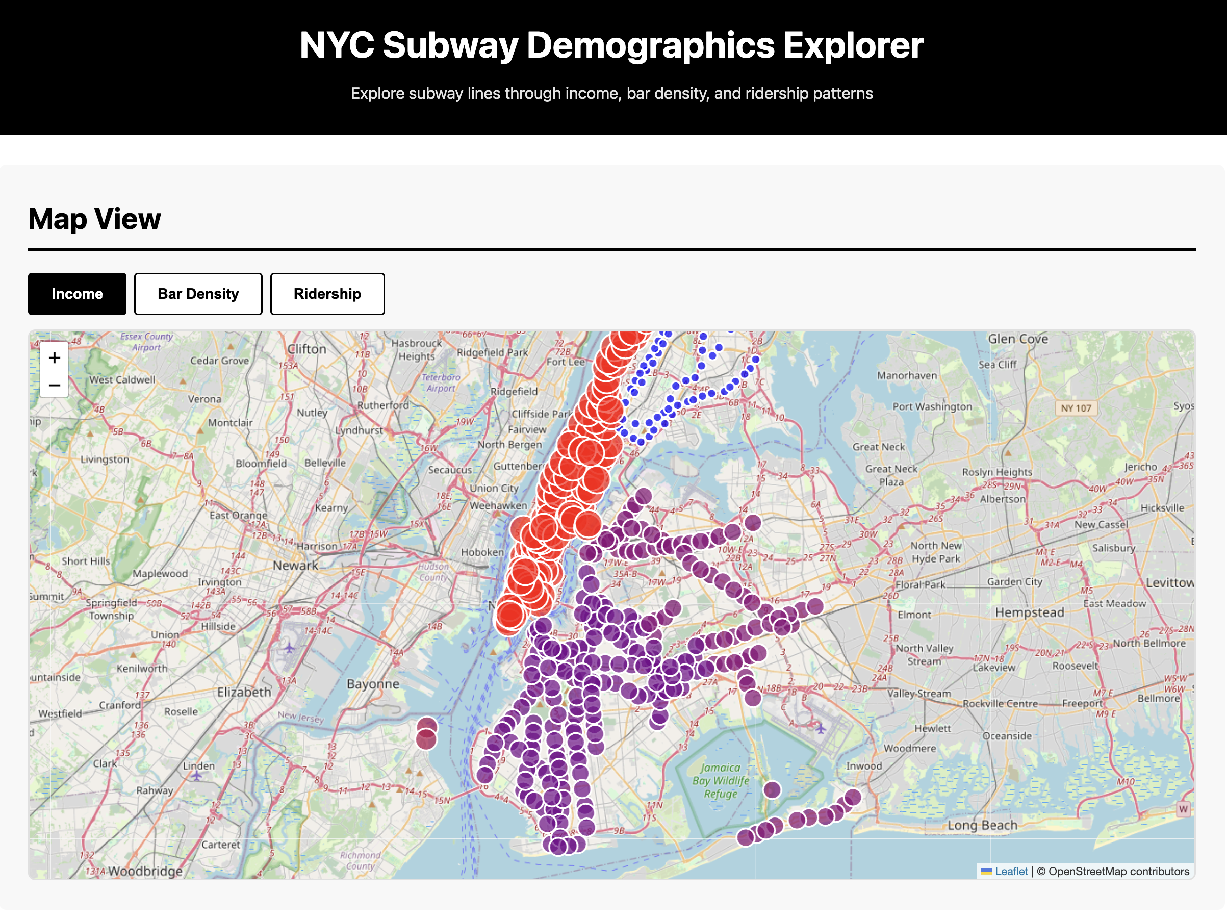
Goal: Build a single-page HTML/JS dashboard to explore subway demographics interactively.
You'll create an interactive map, line comparisons, station explorer, and findings summary—all viewable in a browser with no server required.
Output: website/index.html, style.css, app.js, data/*.json
📄 View Full Prompt (03_website.md)
# Phase 3: Interactive Website

## Goal
Build a single-page HTML/JS dashboard to explore subway line demographics interactively.

## Prerequisites
- All charts from Phase 2
- Processed data as JSON (stations with metrics)
- `outputs/summary.md` findings

## Task
Create a website in `website/` folder:
```
website/
├── index.html
├── style.css
├── app.js
└── data/
    ├── stations.json
    └── lines.json
```

Also create `scripts/03_export_json.py` to convert CSV data to JSON for the website.

## Website Sections

### Section 1: Map View
- Full-width NYC map (use Leaflet with OpenStreetMap or Mapbox)
- Subway lines drawn as colored paths
- Stations as circles
- Color stations by selected metric:
  - Toggle buttons: Income | Bar Density | Ridership
- Click station → popup with:
  - Station name
  - Lines served
  - Median income of area
  - Nearby bar count
  - Daily ridership

### Section 2: Line Comparison
- Dropdown to select any 2-3 lines from full list (A-Z, 1-7, etc.)
- Side-by-side radar charts (use Chart.js)
- Comparison table (dynamic based on selection):
  | Metric | Line A | Line B | Line C |
  |--------|--------|--------|--------|
  | Median Income | $X | $X | $X |
  | Bar Density | X | X | X |
  | Late Night % | X% | X% | X% |
- Sortable ranking table: all lines by any metric

### Section 3: Station Explorer
- Search box (autocomplete station names)
- Select station → show:
  - Mini map zoomed to station
  - Income of surrounding area
  - List of nearby bars (top 5)
  - Hourly ridership sparkline

### Section 4: Findings
- Summary of analysis across all lines
- Key insights discovered (dynamically generated):
  - "Line X has the highest bar density at Y per station"
  - "Line Z has the highest weekend/weekday ratio"
  - "Lines clustered by similarity: [A, C, E] vs [L, G] vs [4, 5, 6]"
- Leaderboard: top/bottom lines for each metric
- Conclusion: Which stereotypes held up? Which surprised us?

## Technical Notes
- Keep it simple — vanilla JS, no frameworks
- Use CDN for libraries:
  - Leaflet: `https://unpkg.com/leaflet@1.9.4/dist/leaflet.js`
  - Chart.js: `https://cdn.jsdelivr.net/npm/chart.js`
- JSON data should be small enough to load client-side
- Mobile-responsive (flexbox/grid)

## Style
- Clean black/white base
- Subway line colors match MTA official colors
- Minimal, data-forward design

## Expected Output
- `website/index.html` — main page
- `website/style.css` — styles
- `website/app.js` — interactivity
- `website/data/*.json` — data files
- Can open `index.html` directly in browser (no server needed)
Phase 4: Experimental
Goal: Push creative boundaries with unconventional data representations like sonification, 3D visualization, or animated flows.
Choose one (or more) experimental approach to make the data feel different—turning numbers into sound, space, or motion.
Output: experimental/ (varies by chosen experiment)
📄 View Full Prompt (04_experimental.md)
# Phase 4: Experimental (Audio/VR/Animation)

## Goal
Push creative boundaries with unconventional data representations.

## Prerequisites
- All processed data from previous phases
- `website/data/*.json`

## Choose One (or More)

---

### Option A: Sonification
**Turn ridership data into sound.**

Create `experimental/sonification.py`:

**Concept:**
- 24-hour cycle compressed to 60 seconds
- Each subway line = different instrument/sound
- Ridership intensity = volume
- Income level = pitch (higher income = higher pitch)

**Implementation:**
```python
# Use: pydub, midiutil, or tone.js (web)
# Assign instrument families by line character:
# - High income lines (4/5/6, 1/2/3): piano/strings
# - Artsy/nightlife lines (L, G): synth/electronic
# - Outer borough lines (A/C, F/M): drums/bass
# - Or let each line have unique timbre
```

**Output:** `experimental/subway_symphony.mp3` or web audio player

---

### Option B: 3D Visualization
**NYC as a living data sculpture.**

Create `experimental/3d_viz.html`:

**Concept:**
- 3D NYC map (Deck.gl or Three.js)
- Subway lines as glowing tubes underground
- Stations pulse/breathe with ridership intensity
- Time slider: watch city wake up (6am) → rush hour → night
- Color-code by income or bar density

**Implementation:**
```javascript
// Use Deck.gl with:
// - PathLayer for subway lines
// - ScatterplotLayer for stations
// - Animation loop for time progression
```

**Output:** `experimental/3d_viz.html` — opens in browser

---

### Option C: Flow Animation
**Animated rider movement.**

Create `experimental/flow_animation.py`:

**Concept:**
- Map of NYC
- Animated arcs/particles showing rider flow
- Morning: residential areas → Manhattan CBD
- Evening: reverse flow
- Weekend: dispersed leisure pattern
- Speed up 24 hours to 30-second loop

**Implementation:**
```python
# Use: matplotlib animation, or export frames for GIF
# Or: Kepler.gl trip layer
```

**Output:** `experimental/daily_flow.gif` or `daily_flow.mp4`

---

### Option D: Voice Narration
**AI-generated audio tour of the data.**

Create `experimental/narration.py`:

**Concept:**
- Generate script summarizing findings
- Use TTS (text-to-speech) to create audio
- "At 8am, the 1/2/3 trains surge with Upper West Side commuters heading to Midtown..."
- Sync with simple visualization

**Output:** `experimental/data_story.mp3`

---

## Evaluation Criteria
- Does it reveal something charts don't?
- Is it memorable/shareable?
- Does it make the data *feel* different?

## Technical Notes
- Web audio: Tone.js (`https://tonejs.github.io/`)
- 3D maps: Deck.gl (`https://deck.gl/`)
- Animation: matplotlib.animation or Pillow for GIF
- Keep dependencies minimal

## Expected Output
```
experimental/
├── sonification.py (or .html)
├── subway_symphony.mp3
└── README.md (explain what you built)
```

or

```
experimental/
├── 3d_viz.html
├── app.js
└── README.md
```
Workshop Info
Course: Cornell Tech AI Society — No Code Workshop
Tool: Cursor IDE
Duration: ~2 hours
Prerequisites: Cursor installed, laptop ready
How to Use This Workshop
- Clone or download the project folder
- Open in Cursor IDE
- Start with Phase 0 — paste the prompt into Cursor's chat
- Complete each phase before moving to the next
- Review outputs at each stage before proceeding
Each prompt tells Cursor exactly what to build and where to save it. You guide the analysis; the AI writes the code.